DataGrid
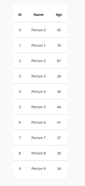
DataGrid displays sets of data across rows and columns.
Getting Started
DataGrid is included in the UraniumUI.Material.Controls namespace. You can add it to your XAML like this:
xmlns:controls="clr-namespace:UraniumUI.Material.Controls;assembly=UraniumUI.Material"
DataGrid can't be used standalone without csharp code. You need to bind some data to ItemsSource property.
public class MainPageViewModel : BindableObject
{
	static Random random = new();
	public ObservableCollection<Student> Items { get; } = new();
	public MainPageViewModel()
	{
		for (int i = 0; i < 10; i++)
		{
			Items.Add(new Student
			{
				Id = i,
				Name = "Person " + i,
				Age = random.Next(14, 85),
			});
		}
    }
	public class Student
	{
		public int Id { get; set; }
		public string Name { get; set; }
		public int Age { get; set; }
	}
}
Then use it in XAML like this:
<controls:DataGrid ItemsSource="{Binding Items}" UseAutoColumns="True" Margin="30" />
| Light - Desktop | Dark - Android | Light - iOS |
|---|---|---|
 |
 |
 |
Customizations
CellItemTemplate
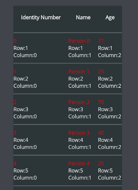
You can customize the cell item template by using CellItemTemplate property. It is a DataTemplate that is used to render each cell item. You can use DataGridCellItem as the root element of the template. It has a DataContext of the cell item. You can use Binding to bind the properties of the cell item.
You can use any property of CellBindingContext object inside DataTemplate.
<material:DataGrid ItemsSource="{Binding Items}" UseAutoColumns="True" HorizontalOptions="Center">
	<material:DataGrid.CellItemTemplate>
		<DataTemplate>
			<VerticalStackLayout VerticalOptions="Center">
				<Label Text="{Binding Value}" TextColor="Red" />
				<Label Text="{Binding Row,StringFormat='Row:{0}'}" />
				<Label Text="{Binding Column,StringFormat='Column:{0}'}" />
			</VerticalStackLayout>
		</DataTemplate>
	</material:DataGrid.CellItemTemplate>
</material:DataGrid>
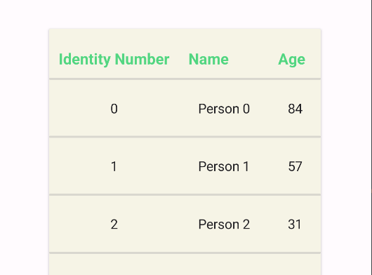
Columns
Auto Columns
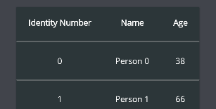
Columns are automatically detected by DataGrid when UseAutoColumns property is set as True. It uses reflection to get properties of the data source. You can use DataAnnosations attributes to define Title of column in auto mode. Adding [DisplayName] attribute to the property will define the title of the column.
[DisplayName("Identity Number")]
public int Id { get; set; }
Custom Columns
You can also define columns manually by adding DataGridColumn to Columns property of DataGrid.
UseAutoColumns must be false. You can remove it from XAML. Its default value is false.
<material:DataGrid ItemsSource="{Binding Items}" HorizontalOptions="Center" Margin="30">
	<material:DataGrid.Columns>
		<material:DataGridColumn PropertyName="Name" Title="Student Name"/>

		<material:DataGridColumn PropertyName="Age" Title="Student Age"/>

		<material:DataGridColumn PropertyName="Id" Title="Identity" />
	</material:DataGrid.Columns>
</material:DataGrid>
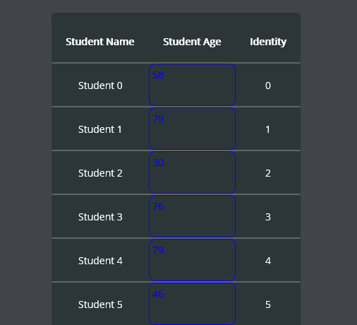
An ItemTemplate can be defined for each column via using CellItemTemplate property of DataGridColumn class.
<material:DataGrid ItemsSource="{Binding Items}" HorizontalOptions="Center" Margin="30">
	<material:DataGrid.Columns>
		<material:DataGridColumn PropertyName="Name" Title="Student Name"/>

		<material:DataGridColumn PropertyName="Age" Title="Student Age">
			<material:DataGridColumn.CellItemTemplate>
				<DataTemplate>
					<Frame BorderColor="Blue" BackgroundColor="Transparent" Padding="5" >
						<Label Text="{Binding Value}" TextColor="Blue" />
					</Frame>
				</DataTemplate>
			</material:DataGridColumn.CellItemTemplate>
		</material:DataGridColumn>

		<material:DataGridColumn PropertyName="Id" Title="Identity" />

	</material:DataGrid.Columns>
</material:DataGrid>
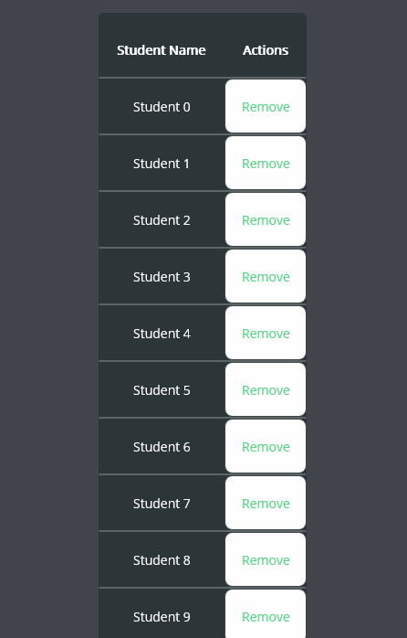
Columns are not limited to the properties of the data source. You can also use custom columns without any property mapping. You can use CellItemTemplate to define the content of the column. That column will be rendered and CellBindingContext will be passed to the template. You can use Data property of CellBindingContext to get the data of current row.
<material:DataGrid ItemsSource="{Binding Items}" HorizontalOptions="Center" Margin="30">
	<material:DataGrid.Columns>
		<material:DataGridColumn PropertyName="Name" Title="Student Name"/>

		<!-- This is a custom column without a property. -->
		<material:DataGridColumn Title="Actions" >
			<material:DataGridColumn.CellItemTemplate>
				<DataTemplate>
					<Button Text="Remove"
							Command="{Binding Source={x:Reference page}, Path=BindingContext.RemoveItemCommand}"
							CommandParameter="{Binding Data}"/>
				</DataTemplate>
			</material:DataGridColumn.CellItemTemplate>
		</material:DataGridColumn>

	</material:DataGrid.Columns>
</material:DataGrid>
Column Width
Column width can be defined by using Width property of DataGridColumn class. It can be set as Auto, Star or a custom value. Its type is GridLength and it'll be passed as parameter to ColumnDefinition. Auto is the default value. It will be calculated automatically. Star will take the remaining space of the grid. You can also set a custom value. It can be a double or a GridLength.
<material:DataGrid ItemsSource="{Binding Items}" HorizontalOptions="Center" Margin="30">
	<material:DataGrid.Columns>

		<material:DataGridColumn PropertyName="Name" Title="Student Name" Width="Auto"/>

		<material:DataGridColumn PropertyName="Age" Title="Student Age" Width="*"/>

		<material:DataGridColumn PropertyName="Id" Title="Identity" Width="100"/>

	</material:DataGrid.Columns>
</material:DataGrid>

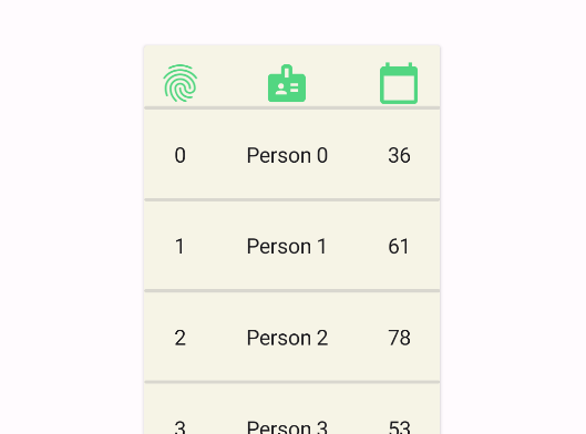
TitleView
You can define a custom view for the header of the column by using TitleView property of DataGridColumn class. It is a View that will be rendered as the header of the column. You can use Binding to bind the properties of the column. Since it's a regular cell of the DataGrid its binding context is CellBindingContext.
 <material:DataGrid ItemsSource="{Binding Items}">
	<material:DataGrid.Columns>
		<material:DataGridColumn PropertyName="Id">
			<material:DataGridColumn.TitleView>
				<Image Source="{FontImageSource FontFamily=MaterialRegular, Glyph={x:Static m:MaterialRegular.Fingerprint}, Color={StaticResource Primary}}" />
			</material:DataGridColumn.TitleView>
		</material:DataGridColumn>

		<material:DataGridColumn PropertyName="Name">
			<material:DataGridColumn.TitleView>
				<Image Source="{FontImageSource FontFamily=MaterialRegular, Glyph={x:Static m:MaterialRegular.Badge}, Color={StaticResource Primary}}" />
			</material:DataGridColumn.TitleView>
		</material:DataGridColumn>

		<material:DataGridColumn PropertyName="Age">
			<material:DataGridColumn.TitleView>
				<Image Source="{FontImageSource FontFamily=MaterialRegular, Glyph={x:Static m:MaterialRegular.Calendar_today}, Color={StaticResource Primary}}" />
			</material:DataGridColumn.TitleView>
		</material:DataGridColumn>
	</material:DataGrid.Columns>
</material:DataGrid>
| Light | Dark |
|---|---|
 |
 |
TitleTemplate
You can define a custom template for the title of the DataGrid by using TitleTemplate property. This is still a table cell and its binding context will be CellBindingContext. You can use Value property of CellBindingContext to get the title of the column.
<material:DataGrid ItemsSource="{Binding Items}" HorizontalOptions="Center" Margin="30">
	<material:DataGrid.TitleTemplate>
		<DataTemplate>
			<Label Text="{Binding Value}" FontSize="Big" TextColor="{AppThemeBinding Light={StaticResource Primary}, Dark={StaticResource PrimaryDark}}" />
		</DataTemplate>
	</material:DataGrid.TitleTemplate>
</material:DataGrid>
| Light | Dark |
|---|---|
 |
 |
EmptyView
You can define a view to be shown when the data source is empty. It can be defined by using EmptyView property of DataGrid.
<material:DataGrid ItemsSource="{Binding Items}">
	<material:DataGrid.EmptyView>
		<VerticalStackLayout Margin="80,20">
			<Image
				WidthRequest="40"
				HeightRequest="40"
				HorizontalOptions="Center"
				VerticalOptions="Center"
				Source="{FontImageSource FontFamily=MaterialOutlined, Glyph={x:Static m:MaterialOutlined.Backup_table}, Color={AppThemeBinding Light={StaticResource OnSurface}, Dark={StaticResource OnSurfaceDark}}}"/>
			<Label Text="No data available..." HorizontalOptions="Center"/>
		</VerticalStackLayout>
	</material:DataGrid.EmptyView>
</material:DataGrid>
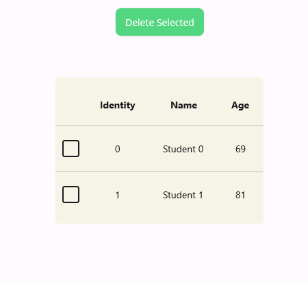
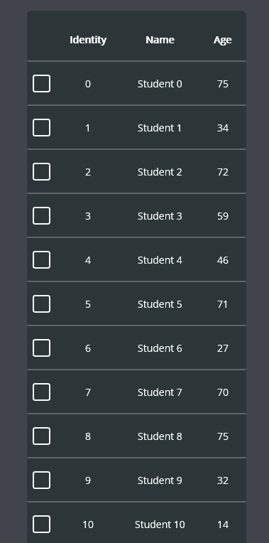
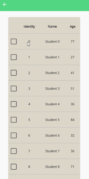
Selection
DataGrid supports multiple row selection. You can add DataGridSelectionColumn column to enable selection. Selected Items can be accessed via SelectedItems property of DataGrid. You can bind it to a property of your ViewModel.
<material:DataGrid ItemsSource="{Binding Items}" SelectedItems="{Binding SelectedItems}">
	<material:DataGrid.Columns>
		<material:DataGridSelectionColumn />
		<material:DataGridColumn PropertyName="Id" Title="Identity" />
		<material:DataGridColumn PropertyName="Name" Title="Name" />
		<material:DataGridColumn PropertyName="Age" Title="Age" />
	</material:DataGrid.Columns>
</material:DataGrid>
| Dark - Desktop | Light - Mobile |
|---|---|
 |
 |
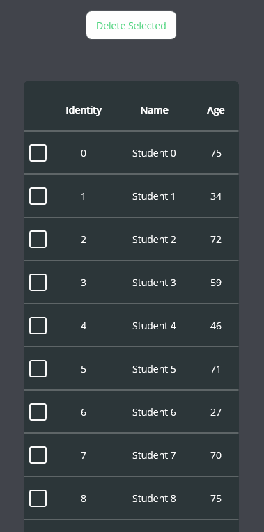
SelectedItems can be handled with ObservableCollection over IList interface. So you can use INotifyCollectionChanged to handle changes in selection. The bound list will be automatically updated. You don't need to register to CollectionChanged event of SelectedItems property.
public class MainViewModel
{
    public ObservableCollection<Student> Items { get; set; }
    public ObservableCollection<Student> SelectedItems { get; set; } = new ObservableCollection<Student>();
    public ICommand RemoveSelectedCommand { get; set; }

    public MainViewModel()
    {
        Items = new ObservableCollection<Student>(GetStudents());

        RemoveSelectedCommand = new Command(() =>
        {
            foreach (var item in SelectedItems)
            {
                Items.Remove(item);
            }
        });
    }
}
<StackLayout>
	<Button Text="Delete Selected" Command="{Binding RemoveSelectedCommand}" />
	<material:DataGrid ItemsSource="{Binding Items}" SelectedItems="{Binding SelectedItems}">
		<material:DataGrid.Columns>
			<material:DataGridSelectionColumn />
			<material:DataGridColumn PropertyName="Id" Title="Identity" />
			<material:DataGridColumn PropertyName="Name" Title="Name" />
			<material:DataGridColumn PropertyName="Age" Title="Age" />
		</material:DataGrid.Columns>
	</material:DataGrid>
</StackLayout>
Tips
You can place an activity indicator inside the DataGrid to show loading state if you make a network call to get data.
<material:DataGrid ItemsSource="{Binding Items}" HorizontalOptions="Center">
	<ActivityIndicator IsRunning="{Binding IsBusy}" Margin="40" />
</material:DataGrid>

CellBindingContext
CellBindingContext is an object that is used as the DataContext of the CellItemTemplate. It has the following properties:
| Property | Description |
|---|---|
Data |
The data of the cell item. |
Column |
The column number of the cell item. |
Row |
The row number of the cell item. |
Value |
The value of the cell item. (You can bind it to the label directly) |
IsSelected |
Indicates whether the cell item is selected or not. |
DataGridColumn
DataGridColumn is a class that is used to define a column of DataGrid. It has the following properties:
Title: It's used in header of the column.CellItemTemplate: It's used to define the template of the cell item of the column.PropertyName: It's used to define the property of the data source that is used to get the value of the cell item. You can leave it empty if you want to use a custom column.