InputKit: Predefined Shapes
Inputkit provides a collection of predefined shapes that can be used as an icon for controls or they can be used standalone.
Usage
You can access Predefined Shapes from anywhere in your code by using static members of PredefinedShapes class.
Following shapes are available:
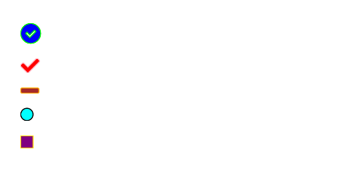
PredefinedShapes.CheckCheckCircleLineSquareDot
You can use these shapes in XAML like below:
    <Path
        Fill="Black"
        Data="{x:Static input:PredefinedShapes.CheckCircle}"/>
List of all available shapes:
  <Path
      Fill="Blue"
      Stroke="Lime"
      StrokeThickness="2"
      Data="{x:Static input:PredefinedShapes.CheckCircle}"/>


  <Path
      Fill="Red"
      Stroke="Pink"
      StrokeThickness="2"
      Data="{x:Static input:PredefinedShapes.Check}"/>


  <Path
      Fill="Brown"
      Stroke="Orange"
      StrokeThickness="2"
      Data="{x:Static input:PredefinedShapes.Line}"/>

  <Path
      Fill="Aqua"
      Stroke="Black"
      StrokeThickness="2"
      Data="{x:Static input:PredefinedShapes.Dot}"/>

  <Path
      Fill="Purple"
      Stroke="Gold"
      StrokeThickness="2"
      Data="{x:Static input:PredefinedShapes.Square}"/>