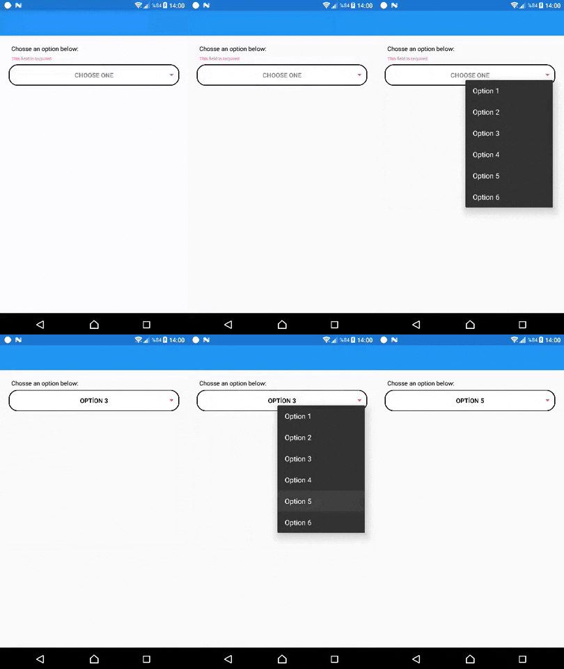
InputKit: Dropdown
Alternative picker with dropdown menu.
It's not supported on MAUI. (Xamarin Forms only)
Properties
- Placeholder: (string) Placehodler Text
- Title: (string) Title will be shown top of this control
- IconImage: (string) Icons of this Entry. Icon will be shown left of this - control
- Color: (Color) Color of Icon Image. IconImage must be a PNG and have - Alpha channels. This fills all not-Alpha channels one color. Default is - Accent
- ValidationMessage: (string) This is message automaticly displayed when - this is not validated. Use this one instead of annotationmessage
- AnnotationColor: (Color) AnnotationMessage's color..
- IsRequired: (bool) IValidation implementation. Same with IsAnnotated
Coloring
There are 6 properties for coloring dropdown and they are confusing. There is explanation for color properties below;

- Color : Simply defines, Icon and arrow color of dropdown. (Icon can be set by
IconImageproperty) - TitleColor : Defines title of this control. (Title can be set by
Titleproperty) - AnnotationColor : Defines annotation color of this control. Annotation will be displayed when this field is required and unselected. This message can be set by 'ValidationMessage' property.
- BorderColor : Defined borders of dropdown. If this is set as
Color.Transparent, shadow will be removed too. - TextColor : Defines text color of dropdown when a value is selected.
- PlaceholderColor : Defines text color of dropdown when no value selected. Default is
WhiteSmoke.
Work in progress...
