StatefulContentView
StatefulContentView is a typical ContentView that has Normal, Pressed, PointerOver states. It is used to display a button, a checkbox, a radio button, etc. It's a useful when you want to create a custom button or a clickable area.
Usage
StatefulContentView is defined in UraniumUI.Views namespace. You can use it in XAML like this:
xmlns:uranium="http://schemas.enisn-projects.io/dotnet/maui/uraniumui"
Then you can use it with uranium:StatefulContentView tag.
<uranium:StatefulContentView LongPressCommand="{Binding DoSomethingCommand}">
    <Border Padding="20" BackgroundColor="{StaticResource Primary}" Stroke="{StaticResource Tertiary}" StrokeShape="{RoundRectangle CornerRadius=5}">
        <Label Text="This is a stateful view" TextColor="{StaticResource OnPrimary}" />
    </Border>
</uranium:StatefulContentView>
| Windows (Dark) | MAC Catalyst (Light) |
|---|---|
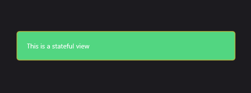 |
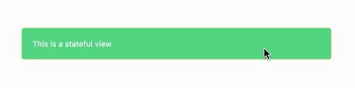 |
Hover over the view to see the
PointerOverstate. A mouse should be connected to see this state on mobile platforms.
Commands
PressedCommand: A command that is executed when the view is pressed.HoverCommand: A command that is executed when the view is hovered.HoverExitCommand: A command that is executed when the view is hovered out.LongPressCommand: A command that is executed when the view is long pressed.TappedCommand: A command that is executed when the view is tapped.CommandParameter: A parameter that is passed to the command.
Visual States
UraniumUI provides a set visual states for StatefulContentView by default. You can use them to change the appearance of the view based on the current state.
Get the following style and customize it according to your requirements in your application.
<Style TargetType="uranium:StatefulContentView">
    <Setter Property="VisualStateManager.VisualStateGroups">
        <VisualStateGroupList>
            <VisualStateGroup x:Name="CommonStates">
                <VisualState x:Name="PointerOver">
                    <VisualState.Setters>
                        <Setter Property="Opacity" Value="0.8" />
                    </VisualState.Setters>
                </VisualState>
                <VisualState x:Name="Normal">
                    <VisualState.Setters>
                        <Setter Property="Opacity" Value="1.0" />
                    </VisualState.Setters>
                </VisualState>
                <VisualState x:Name="Pressed">
                    <VisualState.Setters>
                        <Setter Property="Opacity" Value="0.5" />
                    </VisualState.Setters>
                </VisualState>
            </VisualStateGroup>
        </VisualStateGroupList>
    </Setter>
</Style>