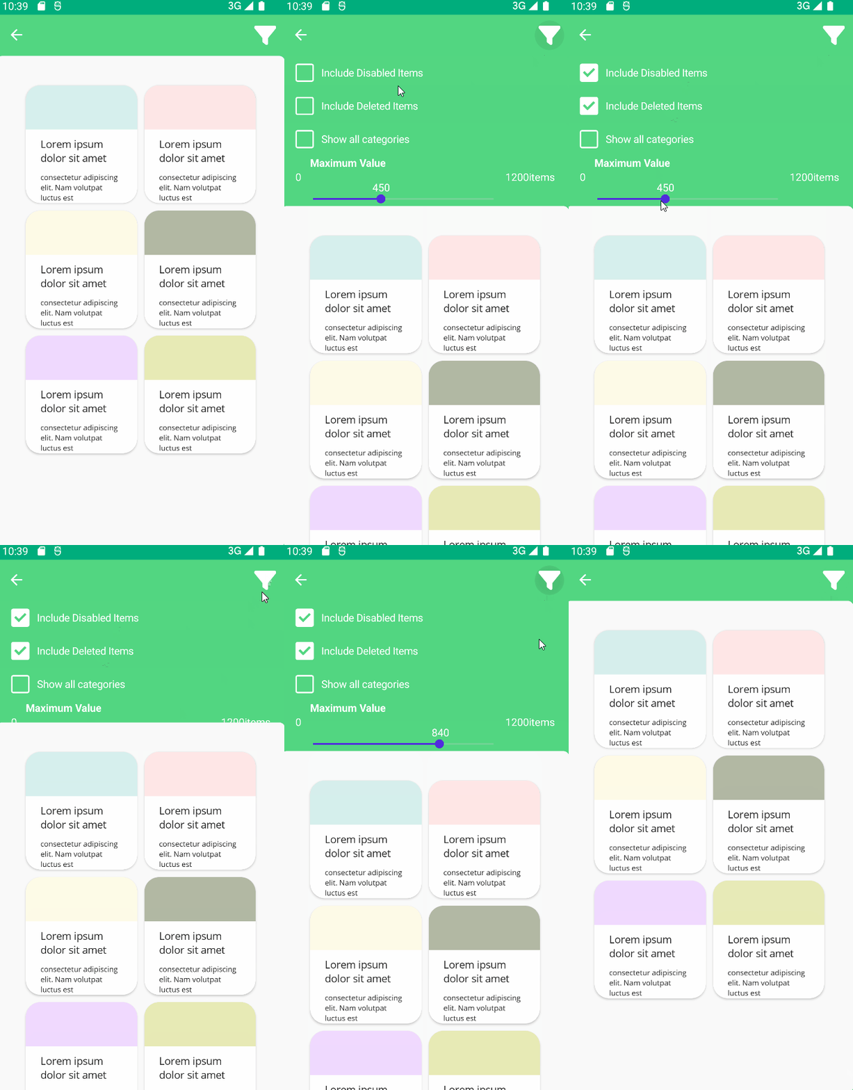
Backdrop
A backdrop appears behind all other surfaces in an app, displaying contextual and actionable content.
You may visit Material Design Backdrops to get more information.
| Regular Implementation |
|---|
 |
Usage
Backdrop is an attachment of UraniumContentPage. So, it can be used only together with UraniumContentPage.
Backdrop is included in UraniumUI.Material.Attachments namespace. Before starting to use Backdrop, you should add material namespace to your XAML file.
xmlns:material="http://schemas.enisn-projects.io/dotnet/maui/uraniumui/material"
To use a Backdrop, you should add a Backdrop to UraniumContentPage.Attachments. B
Backdrop has Title and IconImageSource property and one of them should be set. These are used in toolbar items. Title and Icon will be presented in toolbar items. That toolbaritem will open and close the Backdrop. If your page doesn't include AppBar or you hided it, you can name the backdrop and show/hide it in code.
<uranium:UraniumContentPage x:Class="App1.MainPage"
            xmlns="http://schemas.microsoft.com/dotnet/2021/maui"
            xmlns:x="http://schemas.microsoft.com/winfx/2009/xaml"
            xmlns:uranium="http://schemas.enisn-projects.io/dotnet/maui/uraniumui"
            xmlns:input="clr-namespace:InputKit.Shared.Controls;assembly=InputKit.Maui"
            xmlns:material="http://schemas.enisn-projects.io/dotnet/maui/uraniumui/material">

    <!-- Content here -->

    <uranium:UraniumContentPage.Attachments>
           <material:BackdropView Title="Filter" IconImageSource="filter.png">
            <VerticalStackLayout>
                <input:CheckBox Text="Include Disabled Items" Type="Filled" />
                <input:CheckBox Text="Include Deleted Items" Type="Filled" />
                <input:CheckBox Text="Show all categories" Type="Filled"/>
                <input:AdvancedSlider Title="Maximum Value" MinValue="0" MaxValue="1200" StepValue="10" MaxValueSuffix="items" />
            </VerticalStackLayout>
        </material:BackdropView>
    </uranium:UraniumContentPage.Attachments>
</uranium:UraniumContentPage>
Properties
Title & IconImageSource
Both of Title and IconImageSource is used to add a toolbaritem. If you set Title, it will be used as a text of toolbaritem. If you set IconImageSource, it will be used as an icon of toolbaritem. If you set both of them, Title will be used as a hint text of toolbaritem. Visit Toolbar Items Documentation for more information.
IsPresented
IsPresented is used to show/hide the Backdrop. If you set it to true, Backdrop will be shown. If you set it to false, Backdrop will be hidden. It's a bindable property, you can even bind it in XAML page. You can define x:Name for the bottom sheet and use it in your code.
<uranium:UraniumContentPage x:Class="App1.MainPage"
            xmlns="http://schemas.microsoft.com/dotnet/2021/maui"
            xmlns:x="http://schemas.microsoft.com/winfx/2009/xaml"
            xmlns:uranium="http://schemas.enisn-projects.io/dotnet/maui/uraniumui"
            xmlns:material="http://schemas.enisn-projects.io/dotnet/maui/uraniumui/material">

    <!-- Content here -->

    <uranium:UraniumContentPage.Attachments>
        <material:BackdropView x:Name="backdrop" Title="Filter" IconImageSource="filter.png">
            <!-- ... -->
        </material:BackdropView>
    </uranium:UraniumContentPage.Attachments>
</uranium:UraniumContentPage>
private void OnButtonClicked(object sender, EventArgs e)
{
    backdrop.IsPresented = true;
}