MultiplePickerField
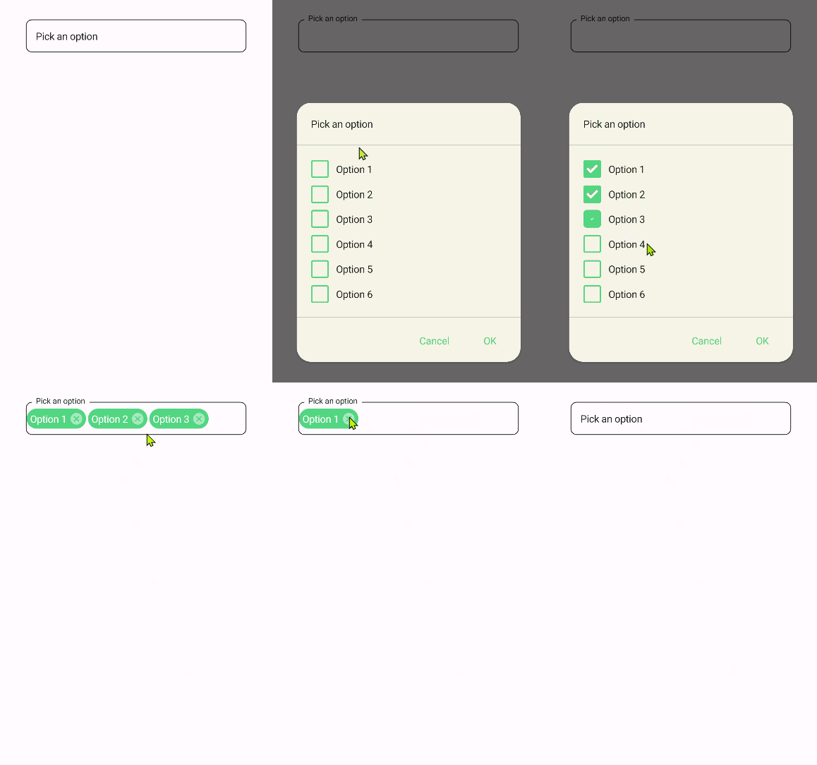
MultiplePickerField is a component that allows you to select multiple values from a list of options.
| Light | Dark |
|---|---|
 |
 |
Usage
MultiplePickerField is included in the UraniumUI.Material.Controls namespace. You should add it to your XAML like this:
xmlns:material="http://schemas.enisn-projects.io/dotnet/maui/uraniumui/material"
Then you can use it like this:
<material:MultiplePickerField Title="Pick some options">
    <material:MultiplePickerField.ItemsSource>
        <x:Array Type="{x:Type x:String}">
            <x:String>Option 1</x:String>
            <x:String>Option 2</x:String>
            <x:String>Option 3</x:String>
            <x:String>Option 4</x:String>
            <x:String>Option 5</x:String>
            <x:String>Option 6</x:String>
        </x:Array>
    </material:MultiplePickerField.ItemsSource>
</material:MultiplePickerField>
Icon
TextFields support setting an icon on the left side of the control. You can set the icon by setting the Icon property. The icon can be any ImageSource object. FontImageSource is recommended as Icon since its color can be changed when focused.
 <material:MultiplePickerField
    Title="Pick some options"
    Icon="{FontImageSource FontFamily=MaterialRegular, Glyph={x:Static m:MaterialRegular.Email}}"/>
AccentColor
The color that is used to fill border and icon of control when it's focused. You can change it by setting AccentColor property of the control.
 <material:MultiplePickerField
    Title="Pick some options"
    AccentColor="DeepSkyBlue"/>