PickerField
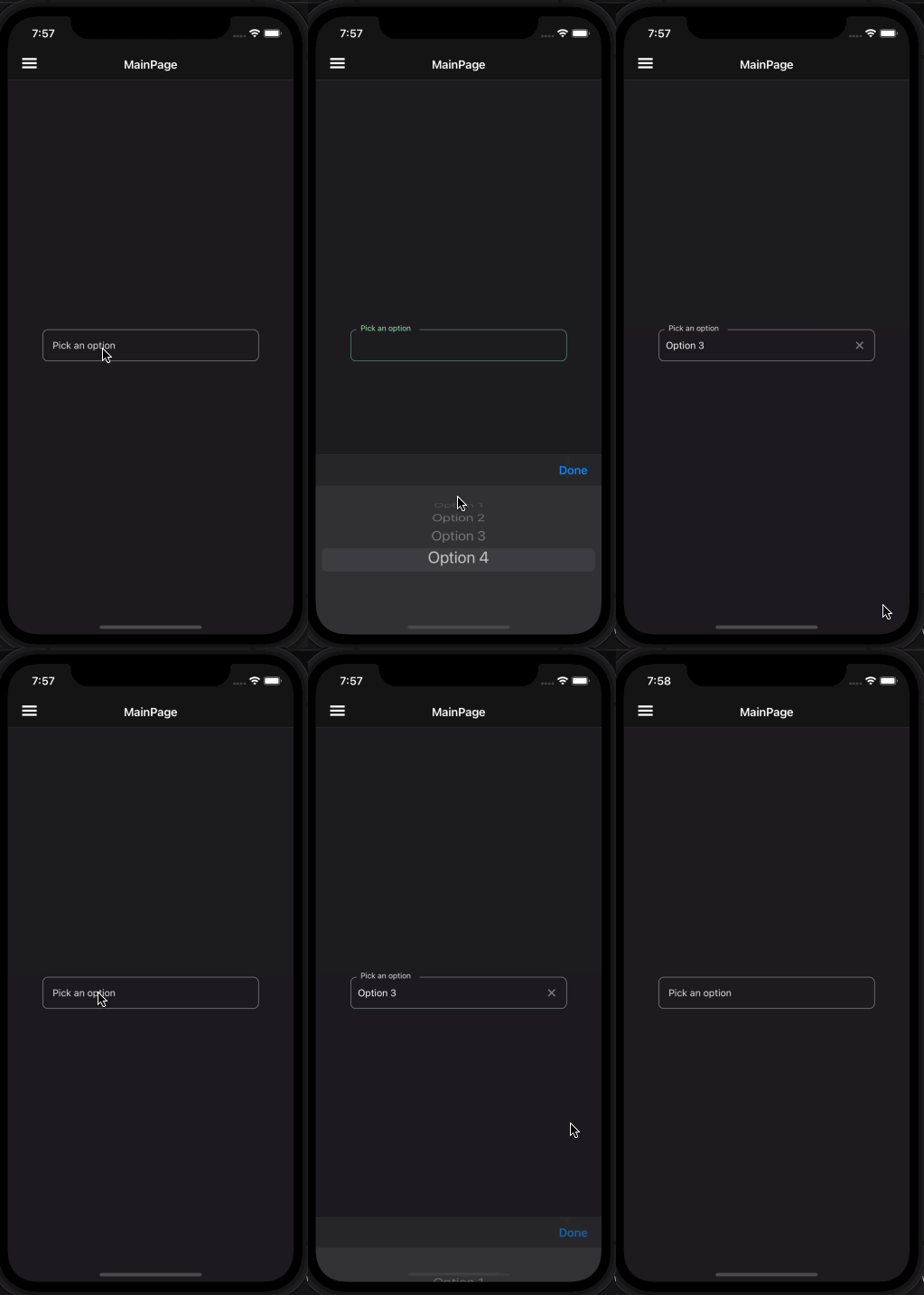
PickerField is a control that allows user to select a value from a list of options. It is a wrapper around the Picker control and makes it in line with the material design guidelines.
Usage
PickerField is included in the UraniumUI.Material.Controls namespace. You should add it to your XAML like this:
xmlns:material="http://schemas.enisn-projects.io/dotnet/maui/uraniumui/material"
Then you can use it like this:
<material:PickerField Title="Pick an option" ItemsSource="{Binding Items}" />
| Light | Dark |
|---|---|
 |
 |
Icon
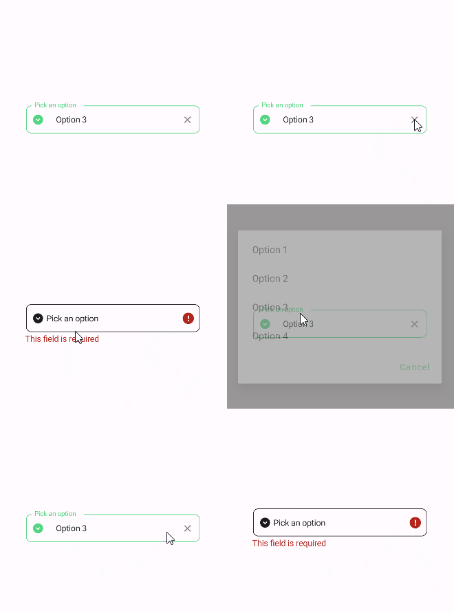
PickerFields support setting an icon on the left side of the control. You can set the icon by setting the Icon property. The icon can be any ImageSource object. FontImageSource is recommended as Icon since its color can be changed when focused.
<material:PickerField
    Title="Pick an option"
    ItemsSource="{Binding Items}"
    Icon="{FontImageSource FontFamily=MaterialRegular, Glyph={x:Static m:MaterialRegular.Expand_circle_down}}"
    />
| Light | Dark |
|---|---|
AllowClear
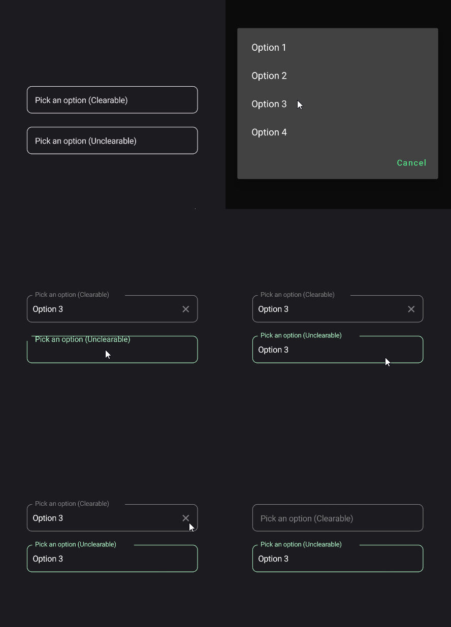
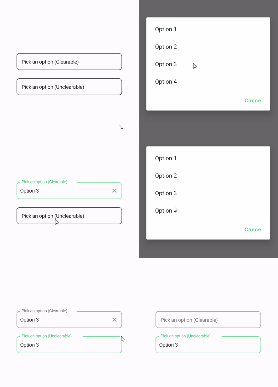
PickerFields support clearing the selected item by setting the AllowClear property to true. Default value is true. You can make it false to disable clearing.
<material:PickerField
    Title="Pick an option (Clearable)"
    ItemsSource="{Binding Items}"
    AllowClear="True" />

<material:PickerField
    Title="Pick an option (Unclearable)"
    ItemsSource="{Binding Items}"
    AllowClear="False" />
| Dark | Light |
|---|---|
 |
 |
Validation
PickerField supports validation rules since it uses object as its SelectedItem. You can use any validation rule that supports your type. For example, if you are using List of int as ItemsSource, you can use MinValueValidation and MaxValueValidation rules. Still RequiredValidation is supported with any type of ItemsSource.
<material:PickerField
    Title="Pick an option"
    ItemsSource="{Binding Items}"
    Icon="{FontImageSource FontFamily=MaterialRegular, Glyph={x:Static m:MaterialRegular.Expand_circle_down}}">
    <validation:RequiredValidation />
</material:PickerField
