EditorField
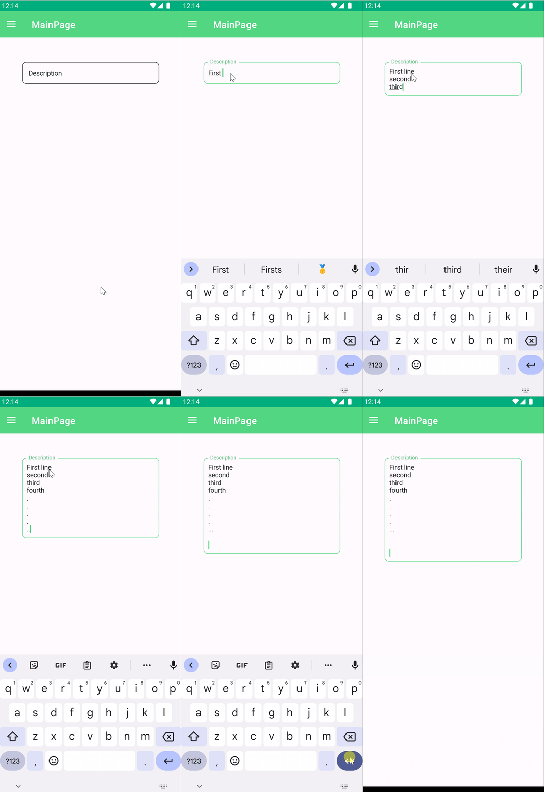
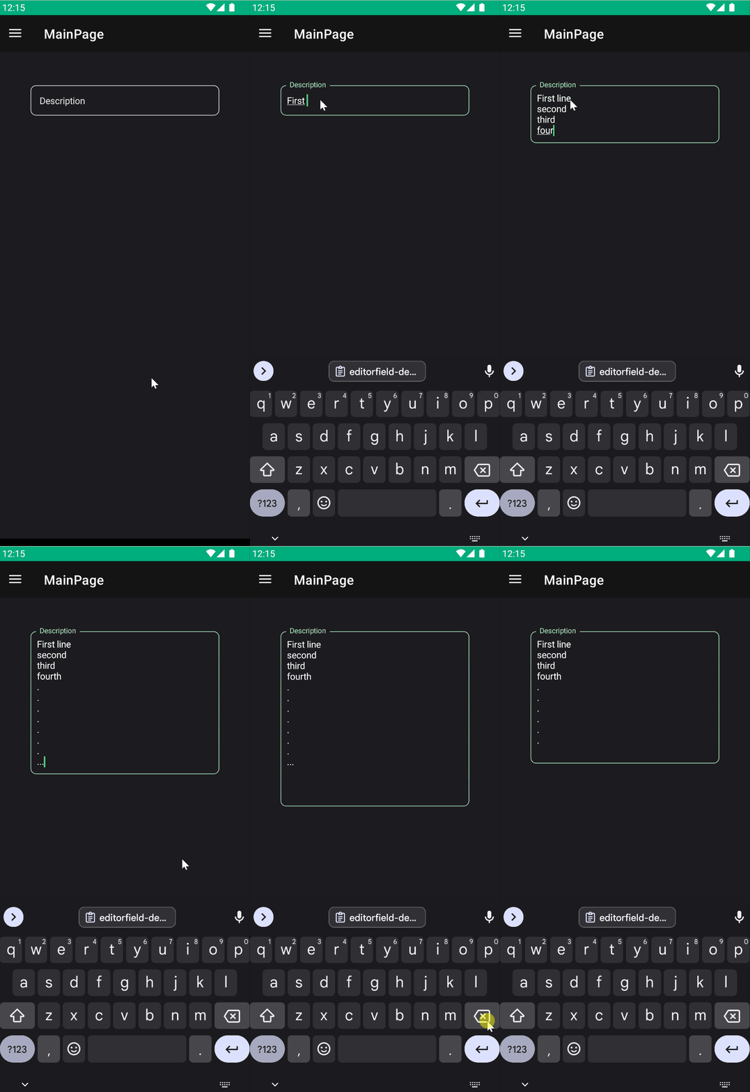
EditorField is a component that allows you to edit multiple lines of text.
Usage
EditorField is included in the UraniumUI.Material.Controls namespace. You should add it to your XAML like this:
xmlns:material="http://schemas.enisn-projects.io/dotnet/maui/uraniumui/material"
Then you can use it like this:
<material:EditorField Title="Description" />
| Light | Dark |
|---|---|
 |
 |
Icon
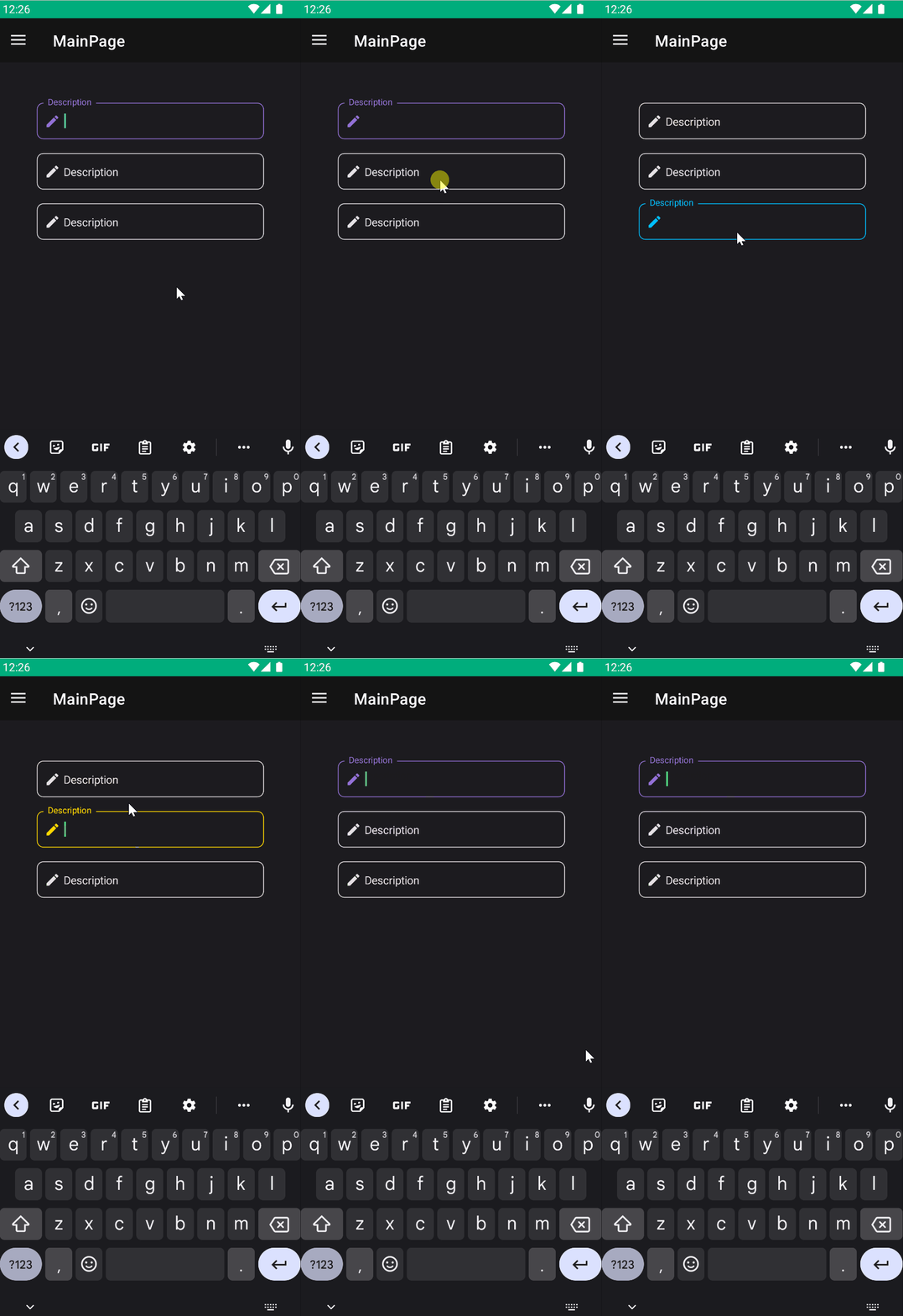
TextFields support setting an icon on the left side of the control. You can set the icon by setting the Icon property. The icon can be any ImageSource object. FontImageSource is recommended as Icon since its color can be changed when focused.
 <material:EditorField
    Title="Description"
    Icon="{FontImageSource FontFamily=MaterialRegular, Glyph={x:Static m:MaterialRegular.Edit}}"/>
AccentColor
The color that is used to fill border and icon of control when it's focused. You can change it by setting AccentColor property of the control.
 <material:EditorField
    Title="Description"
    Icon="{FontImageSource FontFamily=MaterialRegular, Glyph={x:Static m:MaterialRegular.Edit}}"
    AccentColor="DeepSkyBlue"/>
Validation
Validation logic is exactly same with InputKit Validations.
You can define validations by using Validations property. It is a collection of Validation objects. Each Validation object has a Message property that is a string and will be displayed when the validation fails.
UraniumUI provides an easier way than InputKit and allows defining validations without using Validations property. Validations can be placed inside EditorField tags.
<material:EditorField Title="E-mail" Icon="{FontImageSource FontFamily=MaterialRegular, Glyph={x:Static m:MaterialRegular.Email}}">
    <validation:RequiredValidation />
    <validation:RegexValidation Pattern="{x:Static input:AdvancedEntry.REGEX_EMAIL}" Message="Invalid email address" />
</material:EditorField>
FormView Compatibility
EditorField is fully compatible with FormView. You can use it inside a FormView and it will work as expected.
