DatePickerField
DatePickerField is a control that allows users to select a date. It is a wrapper around the DatePicker control and makes it in line with the material design guidelines.
Usage
DatePickerField is included in the UraniumUI.Material.Controls namespace. You should add it to your XAML like this:
xmlns:material="http://schemas.enisn-projects.io/dotnet/maui/uraniumui/material"
Then you can use it like this:
<material:DatePickerField Title="Pick a Date" />
| Light | Dark |
|---|---|
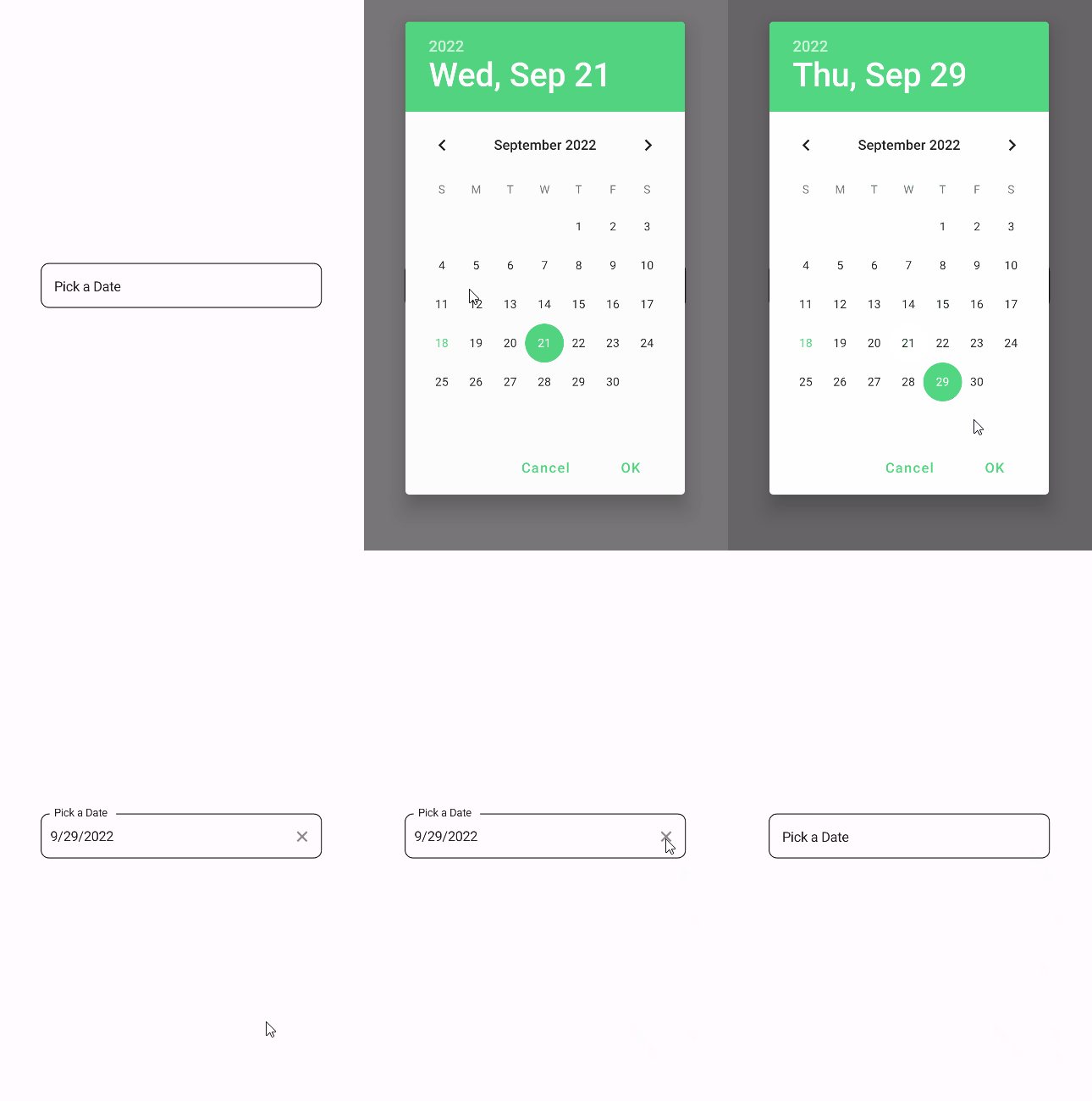 |
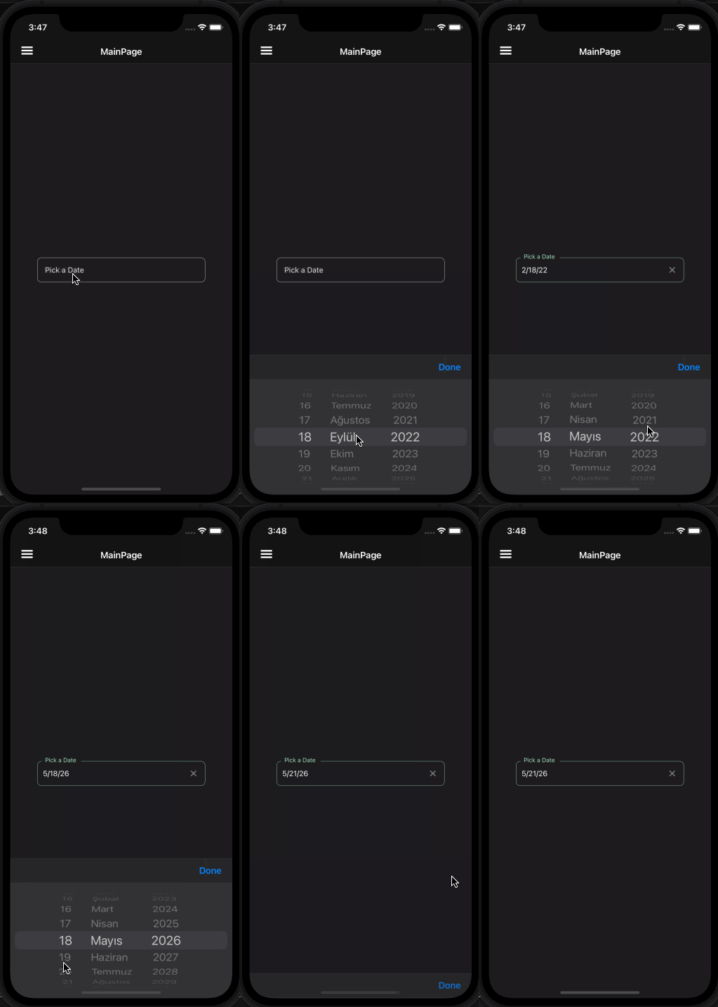 |
Icon
DatePickerFields support setting an icon on the left side of the control. You can set the icon by setting the Icon property. The icon can be any ImageSource object. FontImageSource is recommended as Icon since its color can be changed when focused.
<material:DatePickerField Title="Pick a Date" Icon="{FontImageSource FontFamily=MaterialRegular, Glyph={x:Static m:MaterialRegular.Calendar_month}}" />
| Light | Dark |
|---|---|
AllowClear
DatePickerFields support clearing the selected date by setting the AllowClear property to true. Default value is true. You can make it false to disable clearing.
<material:DatePickerField
    Title="Pick a Date (Clearable)"
    AllowClear="True" />

<material:DatePickerField
    Title="Pick a Date (Unclearable)"
    AllowClear="False" />
| Dark | Light |
|---|---|
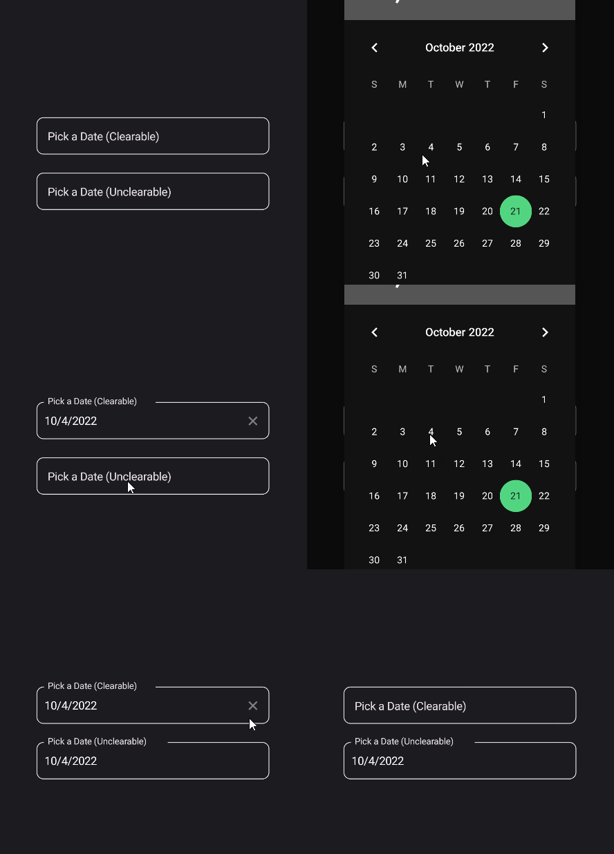 |
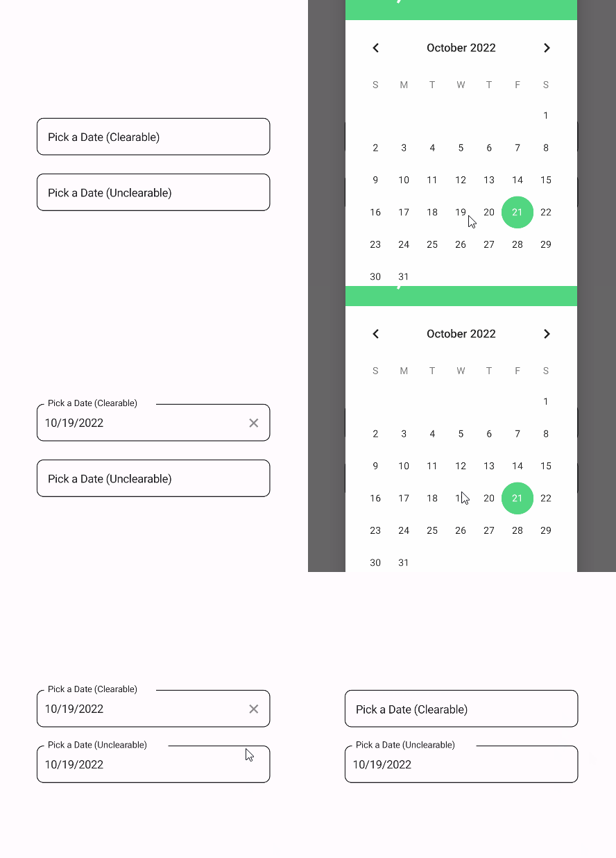 |
Validation
DatePickerField supports validation rules such as MinValueValidation and MaxValueValidation. You can use them like this:
<material:DatePickerField Title="Pick a date" Icon="{FontImageSource FontFamily=MaterialRegular, Glyph={x:Static m:MaterialRegular.Alarm}}">
    <validation:MinValueValidation MinValue="9/18/2022" />
    <validation:MaxValueValidation MaxValue="12/31/2022" />
</material:DatePickerField>
| Light | Dark |
|---|---|
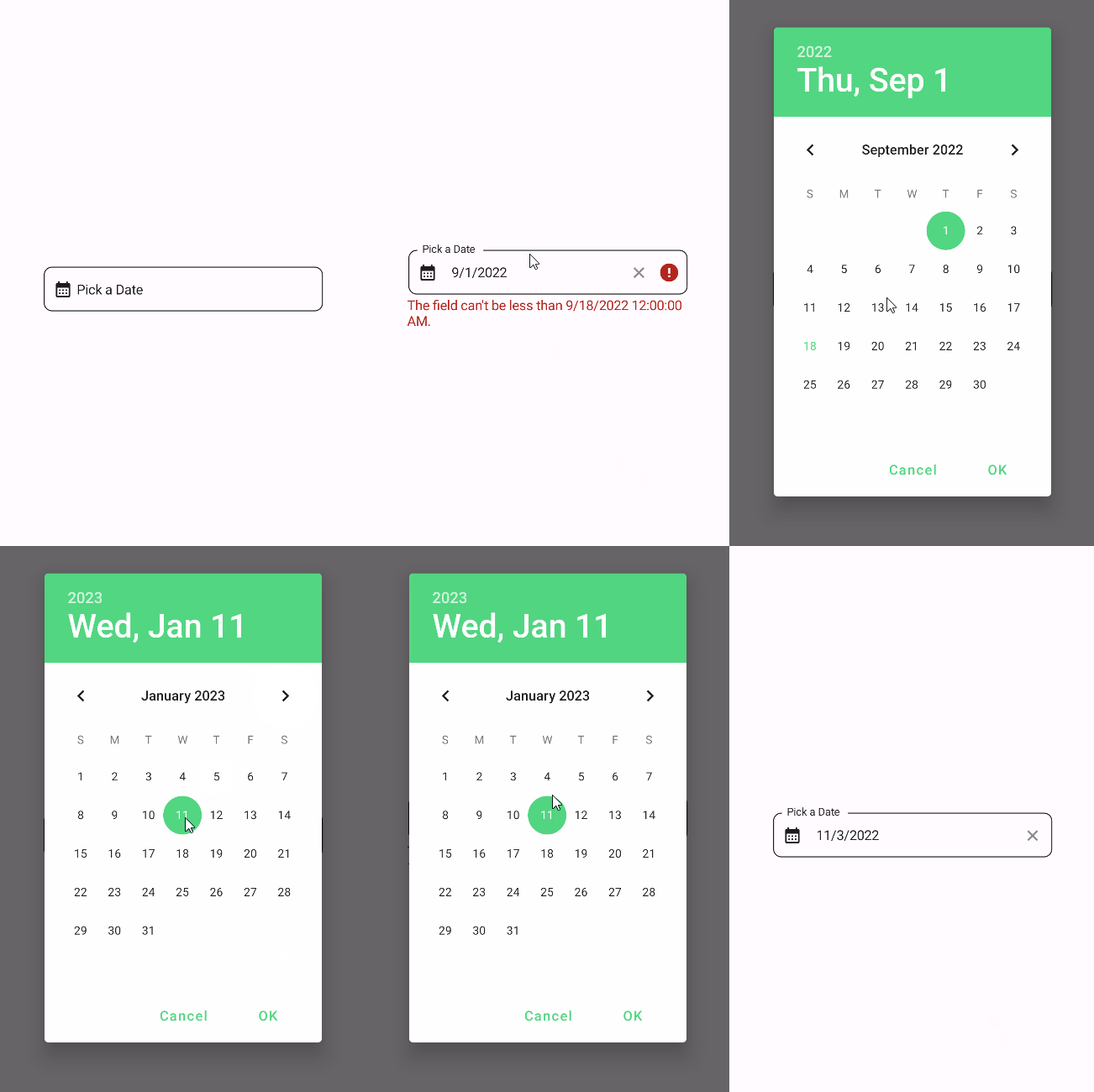 |
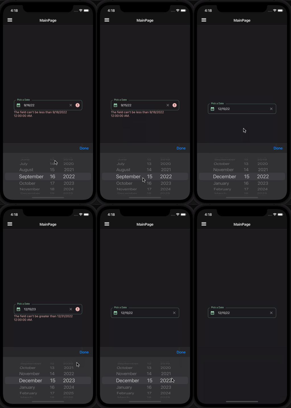 |
FormView Compatibility
DatePickerField is fully compatible with FormView. You can use it inside a FormView and it will work as expected.
 <input:FormView Spacing="20">
    <material:DatePickerField Title="Pick a time" Icon="{FontImageSource FontFamily=MaterialRegular, Glyph={x:Static m:MaterialRegular.Alarm}}">
        <validation:MinValueValidation MinValue="9/18/2022"  />
        <validation:MaxValueValidation MaxValue="12/31/2022" />
    </material:DatePickerField>

    <Button StyleClass="TextButton"
            Text="Submit"
            input:FormView.IsSubmitButton="True"/>

</input:FormView>