ExpanderView
ExpanderView is a view that can be expanded or collapsed. It is useful for showing and hiding content. Common use case is building accordion sections.
Usage
It is defined in UraniumUI.Views namespace. You can use it in XAML like this:
xmlns:uranium="http://schemas.enisn-projects.io/dotnet/maui/uraniumui"
Then you can use it with uranium:ExpanderView tag.
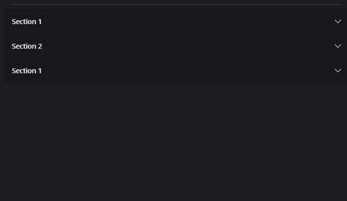
<uranium:ExpanderView>
    <uranium:ExpanderView.Header>
        <Label Text="Section 1" />
    </uranium:ExpanderView.Header>

    <Label Margin="10" Text="This is the ExpanderView's body. It is hidden by default until user clicks/taps the header. The body automatically is shown when user interacts, no custom implementation required. It's animated by default." />
</uranium:ExpanderView>
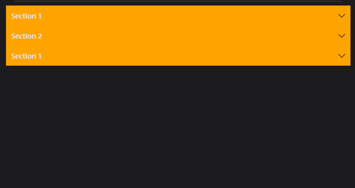
Customizations
You can customize the ExpanderView by using the style properties. You can use the following example to create your own style:
<Style TargetType="Layout" Class="ExpanderView.Header" ApplyToDerivedTypes="True">
    <Setter Property="BackgroundColor" Value="Orange" />
</Style>

<Style TargetType="ContentView" Class="ExpanderView.Content">
    <Setter Property="BackgroundColor" Value="DarkOrange" />
</Style>

<Style TargetType="Path" Class="ExpanderView.Arrow">
    <Setter Property="Fill" Value="Black" />
</Style>