Cascading Styling
Cascading stying brings cascading styling feature to the MAUI. It allows define styles in different scopes separately. Uranium UI provides defining a background for a view and defining color to text colors of all labels in that view.
Usage
To define sub styles in a view scope, you can use the CascadingStyle attached property. It allows to bind a style into a view resources. The style will be applied to all children of the view.
Simple Usage
Firstly, the namespace should be added to file:
xmlns:t="clr-namespace:UraniumUI.Theming;assembly=UraniumUI"
It can be used in a style XAML like that:
<Style TargetType="StackLayout" Class="MyContainer">
    <Setter Property="BackgroundColor" Value="YellowGreen" />

    <!-- 👇 Following styles will be applied only in this 'MyContainer' class  -->
    <Setter Property="t:CascadingStyle.Resources">
        <ResourceDictionary>
            <Style TargetType="Label">
                <Setter Property="TextColor"  Value="Yellow" />
            </Style>
        </ResourceDictionary>
    </Setter>
</Style>
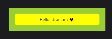
Now you can use your container in a XAML page like the following example. The Label will have the Yellow color in your container. But remaining Labels will stay with the default color.
<Label Text="I'm another label outside 'MyContainer'" />

<StackLayout StyleClass="MyContainer">
    <Label Text="Hello, Uranium ☢️" />
</StackLayout>
Nested usage
You can even use in multiple levels. The example below shows that all the frames will have the Yellow color under MyContainer and all the labels will be black under that frame which is under MyContainer.
<Style TargetType="StackLayout" Class="MyContainer">
    <Setter Property="Padding" Value="10" />
    <Setter Property="BackgroundColor" Value="YellowGreen" />
    <Setter Property="t:CascadingStyle.Resources">
        <ResourceDictionary>
            <Style TargetType="Frame">
                <Setter Property="BackgroundColor"  Value="Yellow" />
                <Setter Property="t:CascadingStyle.Resources">
                    <ResourceDictionary>
                        <Style TargetType="Label">
                            <Setter Property="TextColor" Value="Black" />
                        </Style>
                    </ResourceDictionary>
                </Setter>
            </Style>
        </ResourceDictionary>
    </Setter>
</Style>
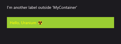
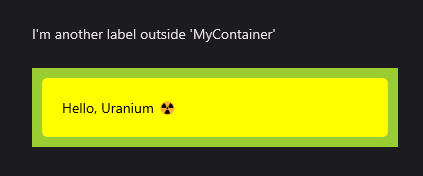
When you run run the following XAML, you will see the following result:
<Label Text="I'm another label outside 'MyContainer'" />

<StackLayout StyleClass="MyContainer">
    <Frame>
        <Label Text="Hello, Uranium ☢️" />
    </Frame>
</StackLayout>
Referencing Existing Styles
You can also reference existing styles in the CascadingStyle.Resources property. The following example shows that using a style that is already defined and how to prevent re-writing it.
<!--This is a common style-->
<Style TargetType="Frame" x:Key="YellowFrame">
    <Setter Property="BackgroundColor"  Value="Yellow" />
    <Setter Property="t:CascadingStyle.Resources">
        <ResourceDictionary>
            <Style TargetType="Label">
                <Setter Property="TextColor" Value="Black" />
            </Style>
        </ResourceDictionary>
    </Setter>
</Style>

<!--This style uses YellowStyle under itself-->
<Style TargetType="StackLayout" Class="MyContainer">
    <Setter Property="Padding" Value="10" />
    <Setter Property="BackgroundColor" Value="YellowGreen" />
    <Setter Property="t:CascadingStyle.Resources">
        <ResourceDictionary>
            <!-- All the styles from YellowFrame will be applied here 👇-->
            <Style TargetType="Frame" BaseResourceKey="YellowFrame"/>
        </ResourceDictionary>
    </Setter>
</Style>
Setting StyleClass
By default StyleClass property is not a bindable property and you can't set it in a style XAML. CascadeStyle.StyleClass allows you set StyleClasses for other views in a style XAML. It can be used like the following example:
<!-- Already defined style -->
<Style TargetType="Button" Class="YellowButton">
    <Setter Property="BackgroundColor" Value="Yellow" />
    <Setter Property="TextColor" Value="DarkSlateGray" />
</Style>

<Style TargetType="View" Class="MyContainer" ApplyToDerivedTypes="True" >
    <Setter Property="BackgroundColor" Value="YellowGreen" />
    <Setter Property="t:CascadingStyle.Resources">
        <ResourceDictionary>
            <!-- All the buttons under 'MyContainer' will has YellowButton as StyleClass -->
            <Style TargetType="Button">
                <Setter Property="t:CascadingStyle.StyleClass"  Value="YellowButton" />
            </Style>
        </ResourceDictionary>
    </Setter>
</Style>
The following usage is enough to apply the style to all buttons under MyContainer:
<StackLayout StyleClass="MyContainer" Padding="20">

    <Button Text="Hello, Uranium ☢️" />

</StackLayout>