
Validations
Validations are a way to validate the input of a field. They are defined in the Validations property of a control that implements IValidatable. The validations property is an array of validation objects which implements IValidation interface. They are some prebuilt validations that you can use or you can create your own validation. Unfortunetely, plain MAUI controls can't be validated at the moment.
You may visit Validations section of FormView documentation of InputKit to see existing validations.
If you're looking for DataAnnotations validation, you should check out the DataAnnotations documentation.
Validations are working compatible together FormView. So, you can use a FormView to create a form and validate the inputs.
| Light - Mobile | Dark - Desktop |
|---|---|
 |
 |
Usage
- Prebuilt validations are defined in
InputKit.Shared.Validationsnamespace. You should add an xml namespace to use them or define your own namespace that contains your validation rules.
xmlns:validation="clr-namespace:InputKit.Shared.Validations;assembly=InputKit.Maui"
- Each UraniumUI Material control accepts validations as content. So, you can define validations in the control's content.
<material:TextField Title="Fullname" Text="{Binding FullName}">
    <validation:RequiredValidation />
    <validation:LettersOnlyValidation AllowSpaces="True" />
</material:TextField>
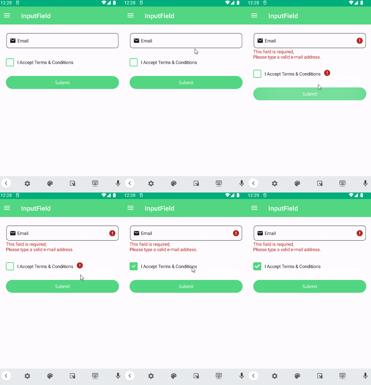
- Using a FormView is the easiest way to validate multiple inputs at the same time.
<input:FormView SubmitCommand="{Binding SubmitCommand}" Spacing="20">
<material:TextField Title="Email" Text="{Binding Email}">
<validation:RequiredValidation />
<validation:RegexValidation Message="Please type a valid e-mail address." Pattern="{x:Static input:AdvancedEntry.REGEX_EMAIL}"/>
</material:TextField>
<material:CheckBox Text="I Accept Terms & Conditions"
IsChecked="{Binding IsTermsAndConditionsAccepted}">
<validation:RequiredValidation />
</material:CheckBox>
<Button Text="Submit"
input:FormView.IsSubmitButton="True"
StyleClass="FilledButton"/>
</input:FormView>
| Light | Dark |
|---|---|
 |
 |
Prebuilt Validations
UraniumUI Material doesn't provide any prebuilt validations. You can use validations from InputKit or create your own.
There are some built-in validations that can be used in your application. They are:
RequiredValidation- Checks if the value is not null or empty.RegexValidation- Checks if the value matches the given regex pattern.MinLengthValidation- Checks if the string length is greater than or equal to the given length.MaxLengthValidation- Checks if the string length is less than or equal to the given length.MaxValueValidation- Checks if the value is less than or equal to the given value.MinValueValidation- Checks if the value is greater than or equal to the given value.NumericValidation- Checks if the value is a number.DigitsOnlyValidation- Checks if the value contains only digits.LettersOnlyValidation- Checks if the value contains only letters.
Accessibility
Validation must be represented as text, not only by color, a border, or a warning icon. UraniumUI Material inputs render failed validation messages below the field, so keep messages short, specific, and actionable.
Recommendations:
- Use
Titlelabels that match the field being validated. - Write messages that explain how to fix the input, such as "Enter a valid email address".
- Use
uranium:FormView.ValidationPathon manually created forms so async or server-side errors appear on the correct field. - Add a form-level validation summary when several fields can fail after submit.
- For masked or formatted inputs, include the expected format in the field hint, placeholder, or nearby helper text.
- Test validation with a screen reader in the target platform when error announcements are required by your app.
Async Form Validation
Use uranium:FormView when the whole form needs an async validation step, such as checking if a username already exists on the server. The form still runs local IValidation rules first. If they pass, it invokes the assigned validator and maps returned errors to the form or to specific fields.
<uranium:FormView Validator="{Binding .}">
    <material:TextField Title="Username"
                        Text="{Binding UserName}"
                        uranium:FormView.ValidationPath="UserName">
        <validation:RequiredValidation />
    </material:TextField>

    <ActivityIndicator uranium:FormView.IsBusyIndicator="True" />

    <Button Text="Register"
            uranium:FormView.IsSubmitButton="True"
            StyleClass="FilledButton" />
</uranium:FormView>
The view model can implement IFormValidator:
using UraniumUI.Validations;

public class RegisterViewModel : IFormValidator
{
    public string UserName { get; set; }

    public async Task<FormValidationResult> ValidateAsync(FormValidationContext context)
    {
        if (await userService.UsernameExistsAsync(UserName))
        {
            return FormValidationResult.PropertyError(
                nameof(UserName),
                "The username has already been taken.");
        }

        return FormValidationResult.Success();
    }
}
Return FormValidationResult.Error("message") for a generic form-level error. Return FormValidationResult.PropertyError("PropertyName", "message") to show the error on a field marked with uranium:FormView.ValidationPath.
[!IMPORTANT]
ValidationPathhas no default value on manually created forms.FormViewdoes not infer it from{Binding UserName}. If a property error is returned for a field without a matchingValidationPath, the error is shown in the form-level validation summary instead of on the field.
uranium:FormView.IsBusyIndicator="True" marks any view as the form busy indicator. The form shows it while async validation is running. If the marked view is an ActivityIndicator, the form also toggles IsRunning.
Creating Custom Validation
You can create your own validation by implementing IValidation interface. It has a Validate method that takes a object as parameter and returns bool as result. The parameter is the value of the control that the validation is applied to. The result is the validation result. If the result is false, the validation message will be shown.
public class MyEmailValidation : IValidation
{
    public string Message { get; set; } = "Please enter a valid email address.";

    public bool Validate(object value)
    {
        if (value is string text)
        {
            return text.Count(x => x == '@') == 1 && text.Split('@').Last().Length >= 2;
        }
        return false;
    }
}
Validation Supported Controls
- TextField : Any validation according to the selected item can be applied.
- PickerField : Any validation according to the selected item can be applied.
- DatePickerField :
RequiredValidation,MinValueValidationandMaxValueValidationare supported. - TimePickerField :
RequiredValidation,MinValueValidationandMaxValueValidationare supported. - CheckBox : Only
RequiredValidationis supported. - RadioButton (RadioButtonGroupView from InputKit)
- AdvancedSlider (From InputKit)