RadioButton
The RadioButton component is used to select a single option from a set of options. UraniumUI uses InputKit RadioButton instead of the MAUI one because it is more customizable and already has a Material theme.
Features
You can visit InputKit RadioButton Documentation to see features. UraniumUI applies only visual changes on it.
Accessibility
Keep related radio buttons inside RadioButtonGroupView so users and screen readers understand the selection group. Use the Text property for each option label. On Windows, Material radio buttons are keyboard-focusable, use the system focus visual, and respond to Enter or Space.
If an option is represented only by an icon or custom visual content, add SemanticProperties.Description to the radio button.
Usage
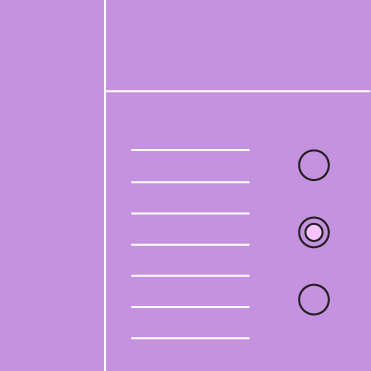
RadioButtons should be grouped together in a RadioButtonGroupView. Otherwise, they will work independently.
RadioButton is defined in UraniumUI.Material.Controls namespace. You can use it like this:
xmlns:material="http://schemas.enisn-projects.io/dotnet/maui/uraniumui/material"
<StackLayout MaximumWidthRequest="400" Margin="20">

    <material:RadioButtonGroupView>
        <material:RadioButton Text="Option 1" />
        <material:RadioButton Text="Option 2" />
        <material:RadioButton Text="Option 3 (Disabled)" IsDisabled="True" />
        <material:RadioButton Text="Option 4 (Disabled)" IsDisabled="True" IsChecked="True" />
    </material:RadioButtonGroupView>

    <BoxView StyleClass="Divider" />

    <material:RadioButtonGroupView>
        <material:RadioButton Text="Option 1" LabelPosition="Before" />
        <material:RadioButton Text="Option 2" LabelPosition="Before" />
        <material:RadioButton Text="Option 3 (Disabled)" IsDisabled="True" LabelPosition="Before" />
        <material:RadioButton Text="Option 4 (Disabled)" IsDisabled="True" IsChecked="True" LabelPosition="Before" />
    </material:RadioButtonGroupView>

    <BoxView StyleClass="Divider" />

    <material:RadioButtonGroupView>
        <material:RadioButton Text="Check Radio Button 1" StyleClass="CheckRadioButton" IsChecked="True"/>
        <material:RadioButton Text="Check Radio Button 1" StyleClass="CheckRadioButton" />
    </material:RadioButtonGroupView>
</StackLayout>
| Dark - Desktop | Light - Mobile |
|---|---|
 |
 |