StatefulContentView
StatefulContentView is a typical ContentView that has Normal, Pressed, PointerOver states. It is used to display a button, a checkbox, a radio button, etc. It's a useful when you want to create a custom button or a clickable area.
Usage
StatefulContentView is defined in UraniumUI.Views namespace. You can use it in XAML like this:
xmlns:uranium="http://schemas.enisn-projects.io/dotnet/maui/uraniumui"
Then you can use it with uranium:StatefulContentView tag.
<uranium:StatefulContentView LongPressCommand="{Binding DoSomethingCommand}">
    <Border Padding="20" BackgroundColor="{StaticResource Primary}" Stroke="{StaticResource Tertiary}" StrokeShape="{RoundRectangle CornerRadius=5}">
        <Label Text="This is a stateful view" TextColor="{StaticResource OnPrimary}" />
    </Border>
</uranium:StatefulContentView>
| Windows (Dark) | MAC Catalyst (Light) |
|---|---|
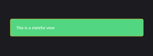 |
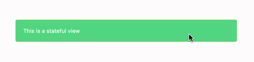 |
Hover over the view to see the
PointerOverstate. A mouse should be connected to see this state on mobile platforms.
Keyboard and Accessibility
Use StatefulContentView when a custom surface must behave like an interactive control instead of a passive layout with TapGestureRecognizer. It exposes an IsFocusable property and UraniumUI handlers provide platform focus behavior for focusable instances. On Windows, Enter and Space trigger the pressed/tapped command path.
Add screen-reader text when the visible content is not enough:
<uranium:StatefulContentView
    TappedCommand="{Binding OpenFiltersCommand}"
    SemanticProperties.Description="Open filters"
    SemanticProperties.Hint="Shows filter options for the current list">
    <Grid Padding="12" ColumnDefinitions="*,Auto">
        <Label Text="Filters" />
        <Label Grid.Column="1" Text=">" />
    </Grid>
</uranium:StatefulContentView>
For app-level guidance, see Clickable Areas.
Commands
PressedCommand: A command that is executed when the view is pressed.HoverCommand: A command that is executed when the view is hovered.HoverExitCommand: A command that is executed when the view is hovered out.LongPressCommand: A command that is executed when the view is long pressed.TappedCommand: A command that is executed when the view is tapped.CommandParameter: A parameter that is passed to the command.IsFocusable: Controls whether the view participates in focus navigation.
Customizations
You can customize the StatefulContentView by using the style properties. You can use the following template to create your own style:
<Style TargetType="uranium:StatefulContentView" ApplyToDerivedTypes="True" CanCascade="True" BaseResourceKey="UraniumUI.Views.StatefulContentView.Base">
    <Setter Property="VisualStateManager.VisualStateGroups">
        <VisualStateGroupList>
            <VisualStateGroup x:Name="CommonStates">
                <VisualState x:Name="PointerOver">
                    <VisualState.Setters>
                        <Setter Property="Opacity" Value="0.8" />
                    </VisualState.Setters>
                </VisualState>
                <VisualState x:Name="Normal">
                    <VisualState.Setters>
                        <Setter Property="Opacity" Value="1.0" />
                    </VisualState.Setters>
                </VisualState>
                <VisualState x:Name="Pressed">
                    <VisualState.Setters>
                        <Setter Property="Opacity" Value="0.5" />
                    </VisualState.Setters>
                </VisualState>
            </VisualStateGroup>
        </VisualStateGroupList>
    </Setter>
</Style>
Note: Make sure
xmlns:uranium="http://schemas.enisn-projects.io/dotnet/maui/uraniumui"namespace exists in your XAML file.