CheckBox
CheckBox is a control that allows the user to choose a boolean value. Use UraniumUI.Material.Controls.CheckBox for UraniumUI's Material-styled checkbox.
Features
UraniumUI's CheckBox supports Material styling and exposes common color properties such as Color, BorderColor, TextColor, and IconColor.
Accessibility
Use the Text property for the accessible label whenever possible. On Windows, the Material checkbox is keyboard-focusable, uses the system focus visual, and toggles with Enter or Space. Disabled checkboxes should use IsDisabled="True" so they do not activate.
If a custom template or surrounding layout hides the visible label, add SemanticProperties.Description so screen readers still announce the purpose of the checkbox.
Usage
CheckBox is defined in UraniumUI.Material.Controls namespace. You can use it like this:
xmlns:material="http://schemas.enisn-projects.io/dotnet/maui/uraniumui/material"
<StackLayout MaximumWidthRequest="400">
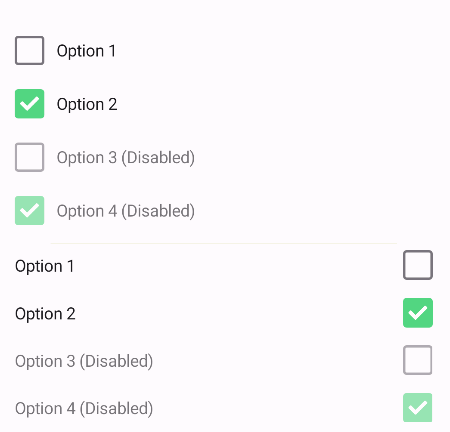
<material:CheckBox Text="Option 1" />
<material:CheckBox Text="Option 2" IsChecked="True" />
<material:CheckBox Text="Option 3 (Disabled)" IsDisabled="True" />
<material:CheckBox Text="Option 4 (Disabled)" IsDisabled="True" IsChecked="True" />
<BoxView />
<material:CheckBox Text="Option 1" LabelPosition="Before" />
<material:CheckBox Text="Option 2" LabelPosition="Before" IsChecked="True" />
<material:CheckBox Text="Option 3 (Disabled)" IsDisabled="True" LabelPosition="Before" />
<material:CheckBox Text="Option 4 (Disabled)" IsDisabled="True" IsChecked="True" LabelPosition="Before" />
</StackLayout>
Colors
You can set colors per checkbox.
<material:CheckBox
    Text="Option 1"
    Color="DeepSkyBlue"
    BorderColor="Gray"
    TextColor="Black"
    IconColor="White" />
For app-wide styling, target the Material checkbox type in your resources.
<ResourceDictionary
    xmlns="http://schemas.microsoft.com/dotnet/2021/maui"
    xmlns:x="http://schemas.microsoft.com/winfx/2009/xaml"
    xmlns:material="http://schemas.enisn-projects.io/dotnet/maui/uraniumui/material">
    <Style TargetType="material:CheckBox">
        <Setter Property="Color" Value="DeepSkyBlue" />
        <Setter Property="TextColor" Value="Black" />
    </Style>
</ResourceDictionary>
And result will be like this:
| Dark - Desktop | Light - Mobile |
|---|---|
 |
 |