
CalendarView
CalendarView is a cross-platform calendar layout for single-date selection. It is rendered with MAUI controls instead of native calendar views, so nullable selection, min/max behavior, and same-date selection are consistent across platforms.
Usage
It is defined in the UraniumUI.Controls namespace. You can use it in XAML like this:
xmlns:uranium="http://schemas.enisn-projects.io/dotnet/maui/uraniumui"
Then you can use it with the uranium:CalendarView tag.
<uranium:CalendarView
    SelectedDate="{Binding Date}"
    MinimumDate="{Binding MinimumDate}"
    MaximumDate="{Binding MaximumDate}" />
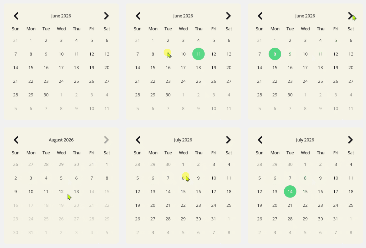
Properties
- SelectedDate: The selected date. Supports
DateTime?and can benull. - DisplayDate: The month currently displayed by the calendar.
- MinimumDate: The earliest selectable date. Dates before this value are disabled.
- MaximumDate: The latest selectable date. Dates after this value are disabled.
- FirstDayOfWeek: The first weekday column. Defaults to the current culture's first day of week.
- VisibleDates: The 42 visible calendar cells for the current display month.
Selection
CalendarView raises DateSelected when a selectable day is tapped, even if the tapped date is already selected. This is useful for picker flows where confirming the same date should still be treated as a user action.
calendarView.DateSelected += (sender, args) =>
{
    var selectedDate = args.SelectedDate;
};
You can also select or clear dates from code:
calendarView.TrySelectDate(DateTime.Today);
calendarView.ClearSelection();
Year Selection
Tap the month/year header to switch from the day grid to a year grid. This is useful for birthdate and other historical-date flows where navigating month-by-month would be too slow. The previous/next navigation buttons move between year pages while the year grid is visible. Selecting a year returns to the day grid and keeps the current month where possible.
Accessibility
CalendarView uses MAUI Button controls for day and year selection, so selectable dates stay in the platform control model. Previous and next navigation buttons expose semantic descriptions such as "Previous month" and "Next month".
When embedding CalendarView in a dialog or custom surface, provide a clear title and instructions near the calendar. If the selected date, disabled date range, or current month needs extra explanation for your users, add nearby text or semantic hints in the surrounding dialog.
For keyboard-heavy flows, verify the full date-selection path in the target platform. See the accessibility follow-up report in the repository for known improvements around month/year header activation and grid-style arrow navigation.
Styling
The view exposes style classes for common parts:
CalendarViewCalendarView.HeaderCalendarView.MonthLabelCalendarView.NavigationButtonCalendarView.PreviousMonthButtonCalendarView.NextMonthButtonCalendarView.WeekdayGridCalendarView.WeekdayLabelCalendarView.DaysGridCalendarView.DayButtonCalendarView.DayButton.OutsideMonthCalendarView.DayButton.DisabledCalendarView.DayButton.SelectedCalendarView.YearGridCalendarView.YearButtonCalendarView.YearButton.DisabledCalendarView.YearButton.Selected