SelectField
SelectField wraps the core Select control in a Material InputField. Use it when you need the overlay-hosted, templated Select behavior with Material input styling, validation, and optional clear support.
Usage
SelectField is included in the UraniumUI.Material.Controls namespace. Add the Material namespace to your XAML:
xmlns:material="http://schemas.enisn-projects.io/dotnet/maui/uraniumui/material"
Then use it like this:
<material:SelectField
    Title="Profile"
    ItemsSource="{Binding Profiles}"
    SelectedItem="{Binding SelectedProfile}"
    ItemDisplayBinding="{Binding Name}" />
| Light | Dark |
|---|---|
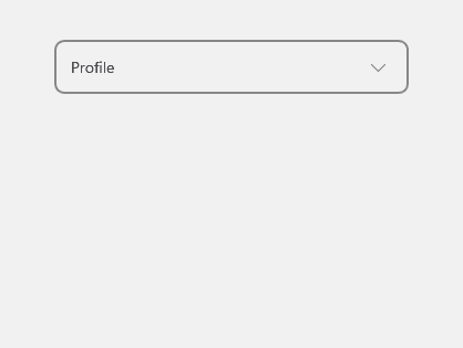 |
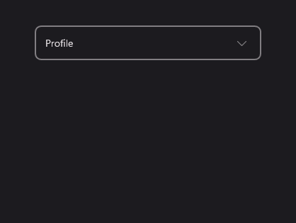 |
Templates
SelectField forwards ItemTemplate, SelectedItemTemplate, and ItemDisplayBinding to its inner Select control.
<material:SelectField
    Title="Profile"
    ItemsSource="{Binding Profiles}"
    SelectedItem="{Binding SelectedProfile}"
    AllowClear="True">
    <material:SelectField.ItemTemplate>
        <DataTemplate>
            <Grid Padding="12" ColumnDefinitions="36,*" ColumnSpacing="12">
                <Border WidthRequest="32" HeightRequest="32" StrokeThickness="0" BackgroundColor="{Binding Color}">
                    <Border.StrokeShape>
                        <RoundRectangle CornerRadius="16" />
                    </Border.StrokeShape>
                    <Label Text="{Binding Initial}" TextColor="White" FontAttributes="Bold" HorizontalOptions="Center" VerticalOptions="Center" />
                </Border>
                <VerticalStackLayout Grid.Column="1" Spacing="2">
                    <Label Text="{Binding Name}" FontAttributes="Bold" />
                    <Label Text="{Binding Description}" FontSize="Micro" Opacity=".65" />
                </VerticalStackLayout>
            </Grid>
        </DataTemplate>
    </material:SelectField.ItemTemplate>
</material:SelectField>
| Light | Dark |
|---|---|
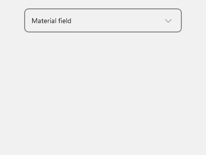 |
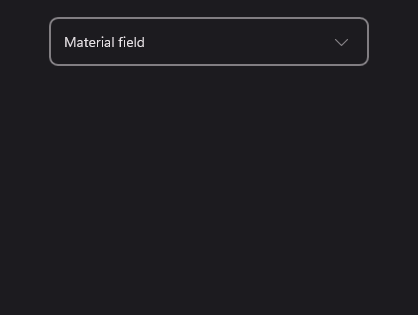 |
AllowClear
Set AllowClear to true to show a clear button when a value is selected.
<material:SelectField
    Title="Profile"
    ItemsSource="{Binding Profiles}"
    SelectedItem="{Binding SelectedProfile}"
    AllowClear="True" />
Validation
SelectedItem is used as the field value for validation rules.
<material:SelectField
    Title="Profile"
    ItemsSource="{Binding Profiles}"
    SelectedItem="{Binding SelectedProfile}">
    <material:SelectField.Validations>
        <validation:RequiredValidation />
    </material:SelectField.Validations>
</material:SelectField>
Keyboard and accessibility
SelectField forwards focus to its inner Select, so it supports the same keyboard behavior: Tab focus, Enter/Space activation, Up/Down item navigation, Home/End jumps, and Escape dismissal. The clear button is keyboard-focusable when visible and exposes a screen-reader description.
Use Title as the field label and keep item text available when using ItemTemplate. If the template uses only icons or color chips, add a semantic description through the template content so screen readers can announce the selected item.
Properties
| Property | Description |
|---|---|
ItemsSource |
The collection of items to display. |
SelectedItem |
The selected item. The default binding mode is TwoWay. |
ItemDisplayBinding |
Binding used to display item text when no item template is provided. |
ItemTemplate |
Template used for each opened list item. |
SelectedItemTemplate |
Template used for the closed selected value. Falls back to ItemTemplate. |
AllowClear |
Shows a clear button when a value is selected. |
SelectedItemChangedCommand |
Command executed when SelectedItem changes. |
SelectView |
The inner Select control. |
Events
| Event | Description |
|---|---|
SelectedItemChanged |
Raised when SelectedItem changes. |
Methods
| Method | Description |
|---|---|
Close() |
Closes the inner Select overlay if it is open. |