Select
Select is a pure MAUI single-selection control that opens an overlay-hosted list of items. It is an opt-in alternative to Dropdown when you need templated item rows, a templated selected value, or more control over the popup colors and sizing.
Usage
Select is defined in the UraniumUI.Controls namespace.
You can access it in XAML with the default UraniumUI namespace:
xmlns:uranium="http://schemas.enisn-projects.io/dotnet/maui/uraniumui"
Then use it like this:
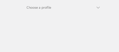
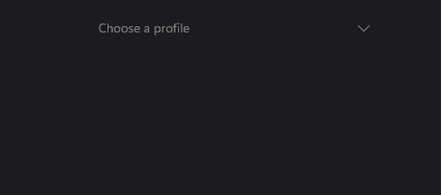
<uranium:Select
    Placeholder="Choose a profile"
    ItemsSource="{Binding Profiles}"
    SelectedItem="{Binding SelectedProfile}"
    ItemDisplayBinding="{Binding Name}" />
| Light | Dark |
|---|---|
 |
 |
Templates
Use ItemTemplate to customize the rows shown in the opened list. Use SelectedItemTemplate when the closed selected value should use a more compact visual than the list rows.
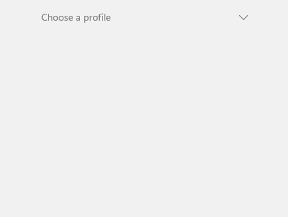
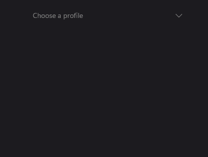
<uranium:Select
    Placeholder="Choose a profile"
    ItemsSource="{Binding Profiles}"
    SelectedItem="{Binding SelectedProfile}">
    <uranium:Select.ItemTemplate>
        <DataTemplate>
            <Grid Padding="12" ColumnDefinitions="36,*" ColumnSpacing="12">
                <Border WidthRequest="32" HeightRequest="32" StrokeThickness="0" BackgroundColor="{Binding Color}">
                    <Border.StrokeShape>
                        <RoundRectangle CornerRadius="16" />
                    </Border.StrokeShape>
                    <Label Text="{Binding Initial}" TextColor="White" FontAttributes="Bold" HorizontalOptions="Center" VerticalOptions="Center" />
                </Border>
                <VerticalStackLayout Grid.Column="1" Spacing="2">
                    <Label Text="{Binding Name}" FontAttributes="Bold" />
                    <Label Text="{Binding Description}" FontSize="Micro" Opacity=".65" />
                </VerticalStackLayout>
            </Grid>
        </DataTemplate>
    </uranium:Select.ItemTemplate>
</uranium:Select>
| Light | Dark |
|---|---|
 |
 |
If SelectedItemTemplate is not set, Select uses ItemTemplate for the closed selected value. If no template is set, it uses ItemDisplayBinding or ToString().
Keyboard and accessibility
Select is focusable by keyboard. It uses the platform focus visual provided by UraniumUI's focusable content handler and exposes generated semantic description/hint text from the selected value or placeholder.
| Key | Behavior |
|---|---|
Tab |
Moves focus to and from the closed control. |
Enter / Space |
Opens the list. When the list is open, selects the active item. |
Down / Up |
Opens the list and moves the active item. |
Home / End |
Moves to the first or last item while the list is open. |
Escape |
Closes the list without changing selection. |
When using ItemTemplate or SelectedItemTemplate, keep meaningful text in the template or set SemanticProperties.Description yourself if the selected value is represented by icons, color chips, avatars, or abbreviations. The opened list is keyboard-controlled by the parent Select, so item templates should not introduce pointer-only actions unless they are redundant.
Properties
| Property | Description |
|---|---|
ItemsSource |
The collection of items to display. |
SelectedItem |
The selected item. The default binding mode is TwoWay. |
ItemDisplayBinding |
Binding used to display item text when no item template is provided. |
ItemTemplate |
Template used for each opened list item. |
SelectedItemTemplate |
Template used for the closed selected value. Falls back to ItemTemplate. |
Placeholder |
Text shown when no item is selected. |
PlaceholderColor |
Color of the placeholder text and arrow when empty. |
TextColor |
Color of the selected text and arrow when a value is selected. |
HorizontalTextAlignment |
Horizontal alignment for text fallback content. |
MaxDropDownHeight |
Maximum height of the opened list. |
DropDownMargin |
Spacing between the anchor and popup edges. |
DropDownBackgroundColor |
Popup background color. |
DropDownBorderColor |
Popup border color. |
DropDownBorderThickness |
Popup border thickness. |
DropDownCornerRadius |
Popup corner radius. |
DropDownShadow |
Popup shadow. |
SelectedItemBackgroundColor |
Background color applied to the selected row in the opened list. |
HoveredItemBackgroundColor |
Background color applied while hovering an item. |
PressedItemBackgroundColor |
Background color applied while pressing an item. |
Methods
| Method | Description |
|---|---|
Open() |
Opens the list if the control is enabled and not already open. |
Close() |
Closes the list if it is open. |
Notes
Select closes its overlay when its handler is detached or when ItemsSource changes. Call Close() before navigation if your page flow needs deterministic cleanup.